Website? Check! Content? Check! Images? Check, again.
Since you know your website is your best online asset, you also probably know that just like in not-online life, first impressions count. And unlike an uncomfortable first day at a new job where your too-high heels cause you to grimace your way through the day (but you can come back tomorrow in the flats you know and love), often, there’s no coming back from a bad first impression online.
Sometimes that’s okay and you can totally recover from the loss. Maybe I wanted a handyman nearer to me. Or fancied Indian food instead of Thai.
…But sometimes, I leave because I’m being shallow and appearances are everything.
The ugly truth is, if you look a little longer and a little closer at your pictures, you might agree with these 9 things glaringly wrong with them:
they’re all stock.
I’m looking at a great haircut, a heart-warming smile and a cheesy thumbs up from the guy next door. But he’s dotted all around the internet in different clothes and poses depending on my choice of blog. He’s as common as a cold! This does nothing to give uniqueness to your business in a way that real pictures would.
they’re broken.
Few things in the world (wide web (!)) mildly annoy me more than the following “image”:
I don’t know if it’s because it shouts “I don’t care enough to have fixed this!” or because my curiosity gets the better of me and I start wondering what was meant to be there, stealing 2 minutes out of my otherwise very productive day (ahem).
they’re invisible.
To Google. ALT text (or tags), short for alternate text, is in place for the visually impaired, or people that block images in email clients or browsers. A huge white space on the page because you couldn’t be bothered to tell me otherwise, is just rude.
Also it pukes all over your SEO to ignore these. Google likes being able to find and index an image based on its name. It also helps me find your website in places like Google’s image search.
they’re too big.
Not to confuse the headline with my love affair with a big pretty image. Lets be clear – there is nothing good about a small, stretched-out pixelated photo, it’s like a bad face lift!
Here, I mean “big” in the sense of file size. I will leave immediately, if I ever experience this:
Hey, you can’t just add a monstrously-huge image and expect me to sit around while my browser copes with resizing it. Easy fix – reduce the file size when saving the image.
they’re too old.
Sometimes, an image referencing something from yesteryear is perfectly well placed (for example, a badge or award for something won in 2014).
Other times, it’s not okay. A good example of this is the use of an old logo after a re-brand.

Think about it, when’s the last time you saw the old serif Google logo anywhere?
they’re off-brand.
No lover of food mistakes a McChicken Sandwich for a Chicken Royale:
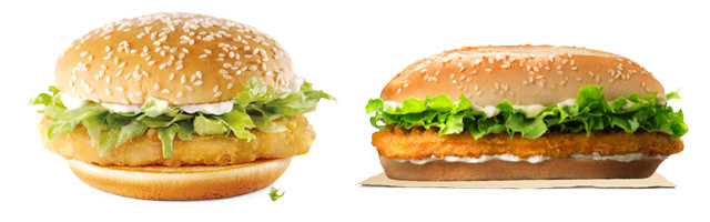
And brand GIANTS like McDonald’s and Burger King do all they can to achieve such distinction. Tickling all 5 senses:
1) they smell great. 2) they sound memorable. 3) they’re tasty. 4) they’re easy to hold (and eat) and 5) their look has imprinted on your brain!
Lighting, colour choices and style all play big parts in brand consistency with imagery.
they’re everywhere.
“Everything in moderation” applies here since too many images can be distracting to the user and can make your website seem unfocused and difficult to navigate (the following image is a screen-shot from arngren.net):
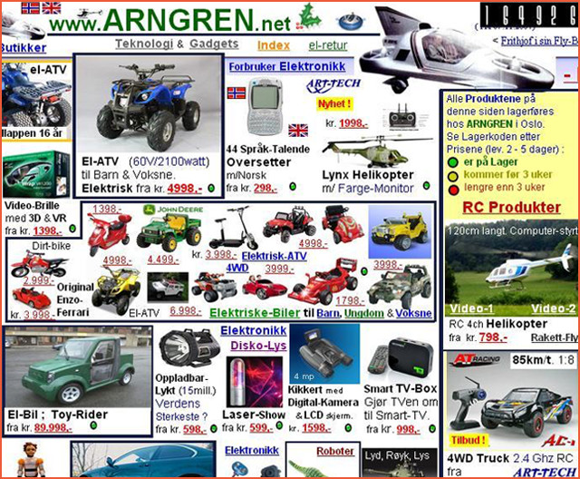
I think images should work like the visual version of an elevator pitch – if I still don’t “get it” after seeing just two or three of them, then I either haven’t had my coffee yet, or the message needs to be clearer.
they’re hiding.
Nobody likes having to wade through blog blocks of text on a bright screen with no breaks. Sometimes, theming or brand continuity means that your website isn’t one that requires the use of many images, for example a corporate website, or online encyclopaedia – however there are some things you can do to improve readability and usability:
- Anchor tags – so the user can jump around (Wikipedia does a great job of this)
- Styling – play around with different font styles, colours and sizes
- Personality – a great way to build images in, is with an “about us” page on the site, showcasing employees partners or certificates you’ve earned
they’re boring.
Trade websites often make this mistake – showing a plumber doing some plumbing isn’t as exciting as you might think.
Showing multiple shots of a tradesmen at work in different rooms of the same house, with the same decor and on the same day, shouts: “we rushed this bit of our portfolio!” It gets the point across, but doesn’t distinguish you from every other plumber doing the same thing.
A good alternative to this, might be a high quality trailer showcasing your best testimonials.
I think that about covers it. Unless I missed one?
Categories: ? Digital marketing advice
Martina
Martina is a Digital Marketing consultant, developing cross-channel techniques since 2010. This blog explores industry developments with real-life application.
Leave a Reply